I've been underground all weekend. That's right, I spent almost an entire weekend in my studio. My studio is in my basement (underground). This weekend I finished 5 of the images for my upcoming solo show at Exhibit A in November. The images were well along in the process already. But they needed to go through one of the most important steps in the process before being sent for professional production: proofing and correcting.
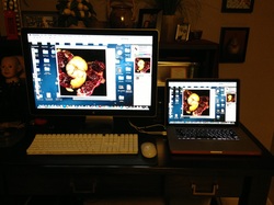
Proofing and correcting is a painstaking process. It comes at the end of making a work. First I must check and recheck each images to be certain that it is properly sized. Next I must view it at 150% of the actual print size to check for imperfections with a fine tooth comb. Dust, scratches and white marks must be carefully removed and retouched. No one wants a print with a big white spot in one corner. This part of the process takes place in my dark studio using two monitors side by side. On the right is my Mac Book Pro and to the left is an Apple Cinema Display. Frankly I can see better looking at the large display. So I connect my laptop to it to increase the area I can visualize.
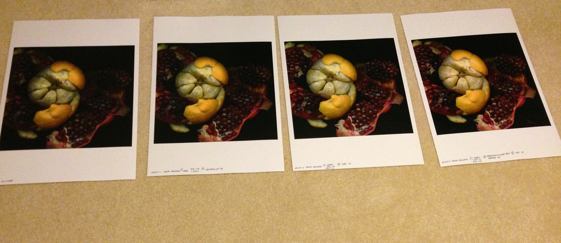
Once all of the retouching is done and I like the colors I'm seeing, the real fun begins. I have to make a series of proof prints that I can use to guide me to getting a print that is actually the way I want it to look. Once in a while it comes out right the first try but usually it takes between 4 and 10 print adjustments to be satisfied that the color is going to come out right.
Right now you many be wondering why all of this is so difficult. In a perfect world, what I see on my screen would match from screen to screen, but it doesn't. Even with Spyder Calibration my laptop never quite matches my Cinema Display. Then there are all kinds of printing issues. I live in a world filled with ICC profiles, variable substrates (papers) and pigment inks. My brand new printer is an Epson 3880. It makes beautiful, archival pigment prints. It also requires an education to run it properly. So far I've discovered it's much more cooperative if I also use Epson paper. Every paper has color tones. The color tones in the paper or surface effect the way the print will look.
Proofing and correcting is a painstaking process. It comes at the end of making a work. First I must check and recheck each images to be certain that it is properly sized. Next I must view it at 150% of the actual print size to check for imperfections with a fine tooth comb. Dust, scratches and white marks must be carefully removed and retouched. No one wants a print with a big white spot in one corner. This part of the process takes place in my dark studio using two monitors side by side. On the right is my Mac Book Pro and to the left is an Apple Cinema Display. Frankly I can see better looking at the large display. So I connect my laptop to it to increase the area I can visualize.
Once all of the retouching is done and I like the colors I'm seeing, the real fun begins. I have to make a series of proof prints that I can use to guide me to getting a print that is actually the way I want it to look. Once in a while it comes out right the first try but usually it takes between 4 and 10 print adjustments to be satisfied that the color is going to come out right.
Right now you many be wondering why all of this is so difficult. In a perfect world, what I see on my screen would match from screen to screen, but it doesn't. Even with Spyder Calibration my laptop never quite matches my Cinema Display. Then there are all kinds of printing issues. I live in a world filled with ICC profiles, variable substrates (papers) and pigment inks. My brand new printer is an Epson 3880. It makes beautiful, archival pigment prints. It also requires an education to run it properly. So far I've discovered it's much more cooperative if I also use Epson paper. Every paper has color tones. The color tones in the paper or surface effect the way the print will look.
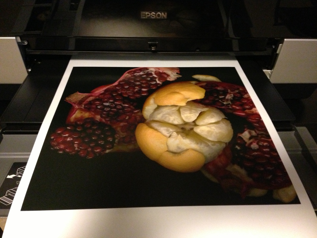
Above is a print coming out of the Epson 3880. It's the 5th and final proof for a new work titled Dance of Life © 2013. This work should remind you a little bit of Renaissance painting with its rich and vibrant symbolic fruit subject matter. There is a peeled orange intertwined with a ripe and juicy peeled pomegranate. In the proofs below you can see that the initial image was far to dark. Each proof represents a series of changes as I work my way through getting a print that looks like what I had planned. This print took 5 proofs to get there. The reason this can be so tricky is that screen color is backlit and prints are not backlit. This changes how we see the color quite dramatically. Just because an image looks great on the screen doesn't necessarily make it great on paper. It takes a lot of work and analyzing to get it just right. This weekend I did this with 5 images. Because my end images actually are infused into aluminum, I proof print on glossy paper to simulate the color brilliance. This seems to be a decent predictor of what the actual print will look like.
Down at the bottom you can see the end result. This image, Dance of Life © 2013 resulted from about 40 hours of work from starting scan to finished retouching and proofing. It's now on it's way to be infused into a aluminum panel that will hang, float mounted on the wall. This one is 24 x 24 inches. I love its bright, rich colors and active composition. It's just dripping with life.
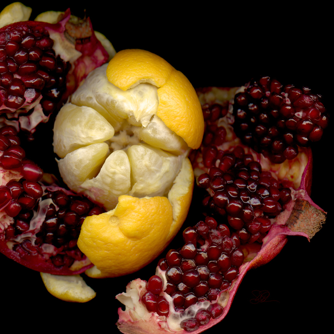
Dance of Life © 2013
 RSS Feed